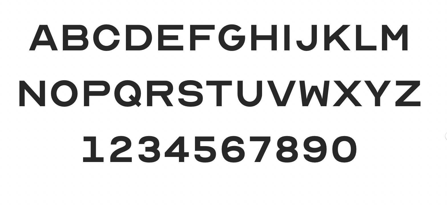
Design firm ANTI Hamar has created a typeface based on the traditional eye chart. It’s called OPTICIAN SANS
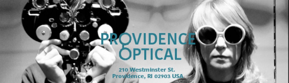
This uncompleted alphabet has been seen by millions when testing their visual acuity by an eye doctor. Optician Kay Louise Sloane created these letters in 1959 as a successor to the Snellen chart, produced a hundred years before that since then they’ve been limited to these 10 letters. Up until now. “We based the typeface on the same 5×5 grid as the original optotype letters and completed the full alphabet including numbers and special characters,” – say creators of ANTI Hamar firm (Norway). It’s called OPTICIAN SANS. The effort began as a rebranding for the optical shop in Norway that wanted to deliver the messages to its customers as clear as possible.
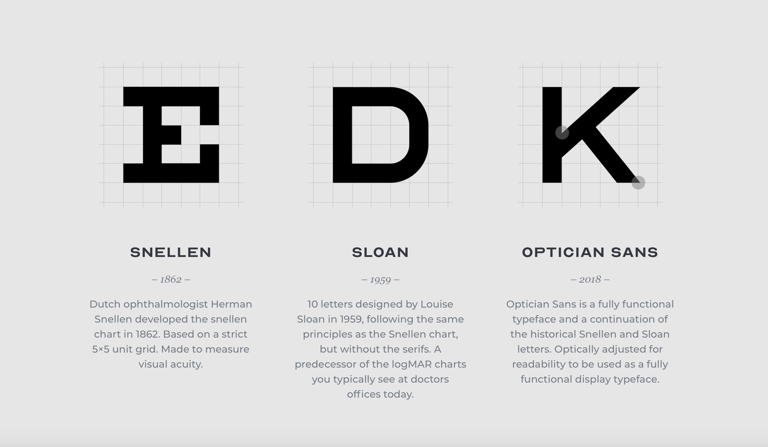
Snellen chart was developed in 1862 to measure visual acuity. Sloan chart was developed in 1952, with the same proportions, but without serifs. Optician Sans was developed in 2018 as fully functional facetype (originally for branding for the optical store in Norway).
Not a bad idea. You can also try this typeface for your business. Maybe it’s the best font for advertising 🙂 The new font is free at
That’s how our name in Optician Sans looks like:


Snellen chart at a doctor office at South Dakota original 1880 Town